Posts tagged color
Pop of color in a big boy room
This post is a part of the Wayfair Homemakers network. I was compensated for this post, but the selections and opinions are my own.

My little boy has been in a big boy room for over a year now. I thought that I'd have his new space all decked out and ready to go before he ever moved from his crib and the nursery. But, as it turns out, L had and has a lot of opinions of his own (seems that I raise opinionated people.) So he's had his main furniture pieces (a great bed and dresser with bookshelf), and we've slowly, oh so slowly, been adding bits and pieces of his style into the space.

L loves color especially orange, and, if I'd let him, he'd go construction-zone orange all over. Instead we've compromised with bits of orange and other bright colors sprinkled around. Also, at four, he's a big Disney lover. Just in case that deep passion doesn't last we've expressed that love with accessories that can be moved in and out as his taste grows.

To complete his dresser, L "decorated" the surface with these very cool, colorful favorites. I applauded his choices and promised that we'd keep each of them. To add a few pieces with less shine and squish, I looked to Wayfair I was on the hunt to add texture and dimension, even a vintage flavor, to his room to compliment the warm woods and the worn-in madras plaid.

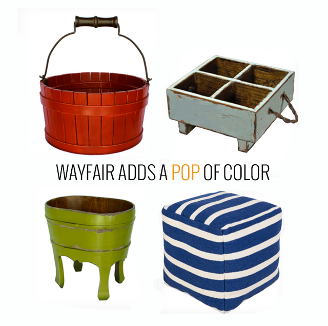
Red bucket, blue milk crate, green plantstand, and striped pouf all available at Wayfair

I fell for the red bucket first, and I loved that I could search by line to discover some other great pieces that had the same worn charm to contrast the new and shiny that L had picked. The plantstand seemed like a perfect corral for favorite stuffed animals, and small toys could look more precious when displayed in a milk crate.

We added his artwork and very favorite toys. His donut painting from his sister's birthday party served as a bright backdrop to the more subdued tones. And the homemade shoebox frame is a virtual brick for the Lego clock that rests upon it. And finally the rubber dinosaur has a place to rest.

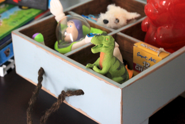
The Disney friends resemble the "Three Men in a Tub" and add a bit of whimsy to the vignette. Also, it's a complete bonus that the green plantstand makes a great imaginary space shuttle, train, and manger when pulled into play!

When my parents visited last weekend, my mom wanted to know where I'd gotten these great antiques for L's room! I snickered and told her they were new from Wayfair I'm still not sure if she believed me. Both pieces have such a nice patina and are made with quality that they make a convincing set of antiques.

His dresser space is now one that is interactive, an open-space toy box, complete with shiny and aged treasures. It's also a space that changes often, as L adds favorites and takes down the plantstand and milk crate to imagine them as some magical addition to his imaginative play.

Stay tuned this summer for a very special piece of artwork that L and I are creating together to hang in his bedroom - it's the perfect DIY for little boys!

So now it's your turn. Are you ready to add some pops of color into your home - indoor or outdoor? The kind folks at Wayfair are letting me giveaway a $100 gift card. All you have to do is comment and link to what you'd purchase with your gift card from Wayfair!! For additional entries, follow Pars Caeli on Facebook and Twitter.

Hurry, hurry, friends, the giveaway will close on May 1 at 12AM EST (only one entry per person). Share this special treat with anyone you know who could use a pop of color in their lives.

Eek! I can't wait to see what goodies you find. Don't forget to link in your comment!

Happy hunting!

xoxo, MJ

a Rafflecopter giveaway


No purchase necessary. By leaving a comment you agree to the rules of this sweepstakes. Each comment to this post equals one entry and must include a name and valid email address to be eligible. A comment must link to a product from Wayfair.com to be considered for this sweepstakes. One entry per household. Limited to entrants over 18 in the US and Canada, residents of Florida, New York, and Rhode Island are ineligible to enter. Contest begins as of the time of this post and ends on Thursday, May 1 at 12:00AM EST. The winner will receive a Wayfair gift card/promo code, a retail value of $100 US. The number of eligible entries received will determine the odds of winning. All comments will be numbered in the order they are received and the winner will be chosen randomly by MJ using the Random Number Generator at random.org. Winner will be notified by email at the address given in their entry and must respond within 72 hours to receive their prize. If the winner does not respond within that time, a new winner will be chosen. The prize will be provided by Wayfair.com. Pars Caeli is not responsible for any problems with receipt of the prize. This contest is governed by the rules of Massachusetts, void where prohibited. This sweepstakes is sponsored by Wayfair LLC, 177 Huntington Ave., Boston, MA, 02115.

 
Bring on the color, Pantone

Happy week, dear friends! Around these parts, it's cold with over a foot of snow on the ground, and it's a monochromatic lover's wonderland.

I am, however, a color fanatic. As much as I want to ooze passion for the shades of white and gray, I just can't. And my spirit is itching for the tones of spring and new life.

Pantone puts out color sheets for every season and many moons ago they posted their colors for spring 2014. When I first saw them, I brushed them off (who needs color suggestions?), but the more middle tone steel gray I breathe in, the more I realize how much I do need it!

So, today's post is just a bit of eye candy for you, to gaze upon the rich palette of colors that await us. And, if you're a bit like me, you'll sneak in these saturated hues before everyone else to offer a breeze of hope and spring! Please forgive the hearts, I'm still in a Valentine-kinda mood.

Placid Blue / Violet Tulip / Hemlock / Freesia / Celosia Orange / Cayenne / Paloma / Sand / Radiant Orchid / Dazzling Blue


What color are you gravitating towards these days?

xoxo, MJ

Chat It Up: Color Must Haves

Heya! Thanks for joining the chat today. I'm home with my little guy and his yuck case of pneumonia. Let's get to talking to cheer me up, k? The topic: color. Specifically the colors we live with and the colors that scream, "this is my abode."

From every window in my house, a static perma-gray landscape can be seen. Living in Northern Indiana, I'm used to at least five months of monochrome. I deal with it by putting a whole lot of color in the interior. Remember the show Trading Spaces? Where they'd take over a neighbor's room and make it a new funky color or glue flowers to the walls - all in a super short period of time? Well, I used to be all about that show especially all the bright hues they'd add to any old dull space.

In the last two years, I've transitioned our main living spaces into more neutral tones to allow just bits of color to be more of the focal. Our once monarch orange kitchen (it was lovely, I promise) is now a classic khaki. And for the most part I'm happy with these more calming neutrals (my house has moved out of the 90s). But there are two rooms whose color I think I "need" to both cheer me and calm me.

Our dining room: For the last decade it's been this ladybug red color, not too bright, not too deep. To me it's the perfect shade of red lipstick and with the wood moulding to frame it in, the saturated tone whispers sit down, stay a long while, and eat, eat, eat.

Our bedroom: I've never had a green room in any house/condo/aptmt I've lived in, and I wanted to give it a try. I found a swatch called "rejuvenation", and I knew I wanted that in my sleepy, cozy, dreamy space. And I adore it. It feels fresh and warm at the same time, and I now identify this color as part of me.

So tell me what colors must you have around your living space? I'm not talking about your favorite colors necessarily, but what feels good for you to live in - that you'd take to another living space just because it's part of you?

Or am I just crazy color lady?

I'm okay with that.

xoxo, MJ


A Spectacular Look for your Blog


  • Pleasing hierarchy of organization through color or font
  • Strong, clean banner or heading
  • Crisp, colorful photos

These are the top three design elements that draw me into a website or blog. How about you? Have you ever thought about what keeps you coming back, besides content, to certain sites for news, ideas, or inspiration?

the original banner for this webhome

Through the great people of Alt Summit, I had the opportunity to learn from the talented Laurie Smithwick, cofounder of Kirtsy and owner of a design studio in Charlotte called LEAP design. I learned a ton, and I adored how she moved us from fine art examples to blog designs - a great recap of art history connected to our modern-day experience of art through computer screen.

Laurie had example upon example to illustrate her points, and already I know I'm not going to do her fabulous skills justice, but here are five simple, doable, put-it-in-your-purse takeaways for your own designs. And, if you can, sign up (for just $15) to take a class with her. You will be delighted you did. Seriously, delight.

1. Use your hotspots

Our literate brains are patterned to follow a certain path, and we transfer that information when "reading" the web. Generally we are drawn to the upper left corner, and then to the right top and then left side bar. Using eye-tracking heat maps (fancy pants technology), researchers have learned our routines so use this natural flow to your advantage (eg: set up your space to have focal points in these three areas). Or, if you choose not to have this flow (and Laurie gave us a lot of great designs that don't), think about the focus areas that you want your readers to follow. 

I like to think of it as a hierarchy of dot to dots. Where should the reader begin, continue, and end?

2. Become friends with white space


Did that emptiness there bother you? Did I lose you in the vast wasteland of white?

And there's an example of white space not helping.

But most of the time, white or empty space can allow your readers to enter into the space. If there's too much happening within the design of the page, there's no place for the eye to go. 

Laurie quoted Channel’s stupendous advice, "Look in the mirror before you leave, and take something away." I was inspired and went right to Blogger to add some easy, breezy white space to Pars Caeli. It feels like a great welcome mat to me.

3. "Your fonts are talking behind your back."

Direct quote from Miss Laurie. 

And, I knew they were. Fonts communicate the mood and style on your blog. Choose them carefully and choose them minimally, like 1 or 2, and at most 3. 

A classic serif font makes happy friends with a strong sans serif. For Pars Caeli, I decided that Didot (serif) and Bebas (sans serif) should be best friends forever. Sometimes we invite other whimsical fonts over for a playdate (like Learning Curve over on the right), just to make sure we're staying social and meeting new font friends.

Need to get out and meet some new fonts? Try some of these Laurie recommends:

FontSquirrel.com
Typekit
Google.com/webfonts
Dafont.com

4. Color, the short list

Color is powerful. Use the force wisely. Colors are not there to merely decorate your web space, but they can also play a unique function in guiding your reader through a site.  Are all your post titles in the same color? Does that connect to your menu or to your Instagram feed?

Readers want a way to organize their time in your space. Help them through the use of 1-5 consistent, beautiful colors.

I was torn on this one, and actually asked Laurie, "what if your banner has more than five colors, could that still work?" Funny enough, she took the time after class to come on over to Pars Caeli.

Here's one of my favorite tweets: "And your site is so lovely. I especially like your favicon! Beautiful work." 

I love my little cloud.


5. Look no further than your lunch for color inspiration

Seriously, she had made the most beautiful lunch. Greens, purples, earthy browns. And she used

Genopal.com/pic2color to make color palettes from a photo

Other great places for color palettes?


I found this color scheme through Design Seeds after salivating and daydreaming through 100s of great choices. I really have to set a time limit on myself when I hop over there to Design Seeds.


So there you have it, my friends. Ready to recreate and subtract? Even if you're not a blogger or web guru, consider how your fashion, stationery, magazine, and interior design choices follow many of these same guidelines. 

Put it in your purse and take it away.

Thanks for stopping over. It's been really wonderful to have you here.
XOXO,
MJ